How much are rents falling around the country?

The latest Daft.ie Rental Report is out today. It shows that rents across the country fell by more than 5% in the first three months of the year. The national average rent now stands at €840 per month, compared to just over €1,000 per month a year ago. Nationwide, rents have now fallen for 14 consecutive months. The fall since the peak early last year has been faster than the rise before that, and with rents 17.5% lower than the peak in early 2008, rents are now back mid-2005 levels.

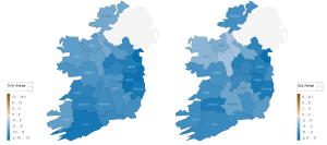
The largest falls in rents have been in the cities. In Dublin and Limerick, rents fell by up to 6.5% in the first three months of the year. In Waterford and Cork cities, rents fell by 5.3% and 5.1% respectively. In Galway, the fall in rents was smaller, at 4.3%. Rents in Dublin’s commuter counties and in West Leinster (i.e. Laois, Longford, Offaly and Westmeath) – presumably an indication of their role as Dublin’s outer and further-outer commuter belts – have fallen by about 6%, more than the national average. At the other end, South-East Leinster (Carlow, Kilkeny and Wexford) and the counties of Connacht and Ulster have seen rents fall by less, typically by about 3.5%. Rents in Leitrim and Roscommon fell by less than 1.5%.

The county-by-county changes are outlined in the map below. As you can see, it’s the extended Dublin area that’s being hit most. For the full details on average rents by county and how much they’ve fallen in the last three months and in the last 12 months, check out the Manyeyes visualization here.

Change in rents by county, 2009 Q1

Change in rents by county, 2009 Q1

The reason for all this is clear – the rental market is feeling the brunt of too much supply and not enough demand. On the supply side, the number of properties available for rent is now over 23,000 – an all time high, certainly compared with the 5000-6000 range we saw on the site up to 2007. This means that landlords are having to fight for tenants, pushing down rents – and rent-a-room income – pretty much everywhere. Add to this falling demand, as Ireland’s most footloose workers head off to pastures new, and it’s pretty clear that the pressure on rents throughout 2009 and maybe into 2010 will be downward pressure.

This report’s commentary is provided by Brian Devine, Chief Economist at NCB Stockbrokers. He highlights the challenges and perils of forecasting facing economists today:

In relation to the property market there have been plenty of forecasts regarding how far residential prices (ranging from -35% to -60%) and to a lesser extent residential rents (ranging from -20% to -35%) are going to fall from peak to trough. Some studies/views on how far prices will fall are based on historical comparisons with previous OECD housing busts. Others invoke the idea of a “fair value” for housing based on, for example, one or more of the following: income-price ratios, mortgage repayment burden, rent-price ratios, rental yield, credit availability, population growth, interest rates and growth in per capita disposable income.

The problem with trying to forecast prices/rents based on the concept of fair value is that prices overshoot and undershoot fair value. The magnitude of the overshoot/undershoot is ultimately determined by psychology. While the psychology of never ending price rises fuelled the market on the way up, economic/job uncertainty and the expectations of further price falls will be the important psychological factors on the way down.

Next week’s property market post will have a look at affordability, i.e. the maths of buying versus renting, based on these figures, and how yields have been affected by the latest falls in rents.

How many Irish homes are in negative equity?

Just over 500,000 thousand homes have been built since the start of 2002. Probably the same number again of second-hand homes have been bought in the same period. With the guts of one million properties having changed hands since 2002, how many of those are worth less than now than when they were bought? And how many owners find themselves owing more to the banks than they if they had to sell now?

Taking the daft.ie asking prices by county from 2006 on, and Dept of Environment regional figures before that, it’s possible to construct regional average prices going back in the 1980s. Fortunately, we don’t have to go back that far – but we do have to go back into the first half of this decade. By my calculations, of the half a million homes built since 2002, about 50% are now worth less than when they were bought. That’s based on current asking prices. If asking prices are – as some contend – about 10% above actual closing prices at the moment, the number of homes worth less now than when they were bought rises to 340,000 homes – or two thirds of the houses built since the start of 2002.

But that’s only half the story. Or slightly less actually, as loans for new homes account for just under 50% of all loans. If that ratio is correct, another 286,000 second hand homes now have asking prices less than the prices they were bought for. Again, if asking prices are 10% above what’s actually trading out there, that figure rises to about 382,500. In total, that represents about 725,000 homes that have been bought since 2004 that are now worth less. Depending on whether you take Census or Dept of the Environment figures, that represents between 37% and 43% of homes in the country. Put in plain English, two in five homes in Ireland are worth less now than when they were bought.

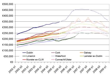
How far back has Ireland’s property market rewound? The graph below shows average home values in eight regions for the period 2002-2009. There are three shades of colour used – the lightest (further to the right) are house price gains that been wiped out, the medium shade represents current asking price levels, while the full colour lines represent asking prices less 10%. Overall, the asking price for the typical home in Ireland now is similar to what the home was worth in March 2005. If you believe asking prices are overstating true prices, the typical home in Ireland is now worth the same as it was in July 2004. The two years of bust have undone the last two and a half years of boom. Homes in Connacht and Ulster are worst affected – they are worth the same now as they were five years ago in early 2004.

When were Irish homes last worth what they're worth now?

When were Irish homes last worth what they're worth now?

Negative equity is, however, something more particular. It refers to the outstanding debt that someone owes the bank. In other words, if they sold the house now, would they be able to pay off the remaining debt from the sale price? Naturally, this is a much more complicated exercise. Dept of Environment figures suggest that the typical loan-to-value of new homes since 2002 has been about 75%, while for second-hand homes it’s been closer to 73%. Fortunately, the figures give something of a breakdown. Making some ballpark assumptions for different years, for example any 95%+ mortgage in 2004 or any 70%+ mortgage in 2007/2008, it’s possible to give a rough estimate of the number of homes in negative equity.

Roughly speaking, about half of the homes that are now worth less than when they were bought are in negative equity, in the financial sense of the word. (This makes intuitive sense, as two out of every five mortgages is less than 70%, suggesting a substantial amount of households with some equity still knocking around.) That’s 340,000 homes where if the homeowners have to sell, they will not be able to pay the bank back solely through the money they get from selling the house.

The punchline is that about one in five homes in Ireland is now in negative equity.

Lopping the top half off & Ireland’s property market in a global perspective

On Monday the latest daft.ie report came out, showing that asking prices had fallen just over 4% in the first three months of the year. Yesterday, I changed focus on the blog a little, as it was Budget day, and tried instead  to put some numbers on what a potential property tax could raise.

Today, I hope to give a little more detail on the findings from the report itself, in particular regional trends, and then give an international perspective also – or at least start to give one, which I think is always instructive. Below is a graph showing the quarter-on-quarter change in asking prices for the last two quarters, i.e. Q4 2008 and Q1 2009, in each county.  The most obvious finding – probably not a surprise to anyone – is that asking prices fell in almost all counties in both quarters. A second clear finding is that there does not appear to have been one or two counties more affected in the last six months than elsewhere (although one could make the argument that Munster has got off relatively unscathed since September).

Quarter-on-quarter changes in house prices, 2008q4-2008q1

Quarter-on-quarter changes in house prices, 2008q4-2008q1

What also jumps out is that the two quarters saw very different patterns. In the final three months of 2008, a few counties – such as Galway, Westmeath and to a lesser extent Donegal and Leitrim – saw the largest downward adjustments in asking prices. Two counties, Mayo and Tipperary actually saw no fall in their asking prices. This quarter, Mayo and Tipperary actually had slightly larger falls than average – perhaps a sign that sellers there had been holding for the start of the year before acceding to the realities of the market. On the flip side, sellers in Galway and Westmeath believed in Q1 that their large adjustments in late 2008 did not need to be followed up with more adjustments straight away.

Sligo has been the worst hit county in terms of falling house prices, with a fall in the region of 10%in three months alone. (Dublin city centre and Waterford city actually saw bigger falls but they are lessened by other parts of their counties.) Aside from that, it seems that Dublin generally and the counties around it were among those with larger adjustments since the start of the year.

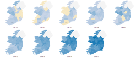
This leads on to perhaps a more interesting question – how have counties fared since their property prices peaked? To do that, I’ve set up another Manyeyes dataset (which anyone can access) with the percentage gap between house prices in a given quarter and the peak, for each county. Where a county is sandy coloured, that means it has peaked. The deeper the blue, the bigger the fall. (One little trick with these figures is that for a county’s earlier “blues”, prices are still going up. By the second row, that’s no longer an issue.)

Change in asking prices from the peak, 2007-2009

Change in asking prices from the peak, 2007-2009

A couple of findings emerge, based interestingly on alternate axes of the country:

  • East peaked before west, on average, and by almost six months. If you draw a line from Cavan down to Wexford, 10 of the 13 counties peaked in the first half of 2008, more than half the country in population terms, including all of Dublin and its offshoots. Cork, Galway, Limerick and a few other counties actually peaked in the second half of 2007, while a couple of stragglers – Tipperary and Westmeath to be precise – only peaked in early 2008. (Interesting to note, in passing, their sellers’ totally different reactions to conditions in late 2008, as per the first chart above.)
  • North is falling faster than south, on average. If you draw a line from Dublin over to Galway, 9 of the 10 worst affected counties so far come from that half of the island. The top half of the property market – literally! – has been lopped off more than the bottom half. This means that the north-east – essentially Dublin-plus – fell first and is falling hardest, while the south-west – Munster – was last to fall and has fallen least so far. It will be interesting to compare these emerging trends, two years into the property crash, with the final statistics on Ireland’s property readjustment/crash/Armageddon/return to sanity/fill in name here.

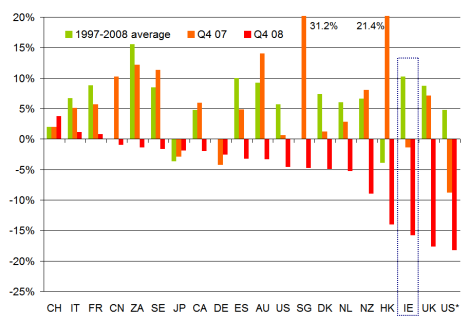
Speaking of writing the history books, perhaps it’s no harm to have a quick look to our left and our right and see how other property markets are faring. Below is a chart of about 20 countries (with two different measures in there for the US, the first is the OFHEO measure, while US* is the Case-Shiller national index). I’ve based this on data posted on the Economist’s website, but have surreptitiously replaced the 2007/2008 ESRI data, about which there is a lot of scepticism currently, with daft.ie data. The bars show the annual rate of change in house prices, including a 1997-2008 average, and figures for 2007 and 2008. (As per the Economist website, some of the Q4 08 figures are actually Q3 08 while a couple, including Ireland, are Q1 09.)

International comparison of property markets, 1997-2009

International comparison of property markets, 1997-2009

Replacing the ESRI data with the daft.ie had the effect of moving Ireland from the “Club of Moderates” such as Denmark and the Netherlands, to the “Bleeding Edge” group with Hong Kong, the UK and the US (at least one measure for the US at any rate). I will do my best to try and track down the original data for this series so that a change-from-peak measure can be contructed as again that may be more instructive than a year-on-year change, particularly in six months time.

In the meantime, though, I’ll leave this up here and ask for any insights, comments or queries, as per usual! Fire away…