Five years, six property markets, mixed fortunes

Last week, there was a brief discussion on thepropertypin of an interesting piece of economic history – in the 60 years following their construction in the late 1780s and early 1790s, the Georgian houses of Mountjoy Square fell in value by almost 94%. By comparison, nominal wages fell about 40%-50% during the same period, while the price of food – if bread is anything to go by – stayed largely the same (8 pence for a loaf of bread in the 1790s and in 1848). While I can’t claim to speak for anyone else reading, I would imagine the general perception was: “So property prices can adjust downward by percentages scarily close to 100% – but it probably takes a unique set of circumstances (Act of Union and all that).”

Yesterday, however, I read on Carpe Diem about the latest property price statistics from Detroit. Houses in Detroit are selling for an average of $11,500 at the moment, down an astonishing 88% from their peak values. That translates into a monthly mortgage payment of $50! And this happened not in 60 years of steady economic decline but in less than five years.

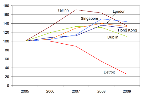
It got me thinking about Ireland’s property market in a global context, so I decided to do a little comparison of 2005-2009 for a smattering of cities. The cities were chosen in no particular way other than to give some global coverage, hence two Asian and one American cities, as well as two Western European and an Eastern European city. The figures refer to the start of the year concerned, with Jan 2005 set at 100 for all cities.

Property prices in six cities around the world, Jan 2005-Jan 2009

Property prices in six cities around the world, Jan 2005-Jan 2009

It was a slight surprise to see that, of the cities shown, none apart from Detroit had yet fallen below their Jan 2005 levels by the start of 2009. Indeed, some cities almost 50% above their 2005 levels. Dublin was closest – and more than likely has already fallen back to mid-2004 levels since the start of the year. Tallinn seems to be like an excess version of Dublin – rising and now falling faster. For Singapore and Hong Kong, 2007 seems to have been easily the craziest year, but the correction in 2008 was nowhere near as large. Meanwhile, Detroit props them all up.

For a view on how much more of a correction is needed for five economies, including the US, Ireland and Spain, you can have a look at property yields over the medium term here.

How many mortgage-holders are faced with unemployment?

A couple of weeks ago, I discussed the likely extent of the problem of negative equity and homes worth less than when they were bought. This had led to a rich vein of suggested blog posts as extensions, including last week’s look at which counties have suffered most from “unexpected” unemployment since the start of the recession.

That post was a first step towards estimating how many households are faced with both unemployment and negative equity. Today’s post is an intermediate step: how many mortgage-holders are unemployed? How does this vary across counties? And what would it look like if the Live Register were to hit 500,000, as some have suggested it might?

There are about 1.7 million households in the country – almost 600,000 were mortgage-holders in the Census of 2006 and they have been joined by another 90,000 or so first-time buyers since then. (Landlords and buy-to-let investors are of course another issue, but I’ll leave them out for the moment.) At the same time, since the Census, the number on the Live Register has increased from 155,000 to 385,000, meaning there are about 230,000 “unexpected unemployed” around the country, many of whom would have bought property at some point over the last decade or two assuming a stable employment situation.

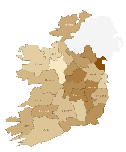
Working out how many of those two groups intersect is not a precise science. Given the broad nature of the economic downturn in Ireland, I have assumed that unemployment has been indiscriminate across working households, i.e. of the 230,000 new unemployed, 55% are in homes with a mortgage, the same ratio in the broader labour force. The map below gives the approximate percentage of households with a mortgage where one person has become unemployed since the recession started. The national average is about 7% of households with a mortgage (or one in fifteen) are currently faced with unemployment.

Unemployment among mortgage-holders in Ireland by county

Unemployment among mortgage-holders in Ireland by county

It might be useful to walk through one county to explain in more detail. In Louth, where there are 44,000 households, about 14,000 of them are more than likely households with retired (and mortgage-free) inhabitants. Of the remaining 30,000 households, just under 20,000 are owner-occupiers with mortgages. At the same time, almost 9,000 people have been added to the number of unemployed people in Louth in the last two years. Assuming that the spread of unemployment was not related to home ownership status, that would mean that 60% of the new unemployed – or just over 5,000 people – are mortgage-holders. If those figures are at least in the right ballpark, that means that one in eight households with a mortgage in Louth is dealing with unemployment.

If you go to the original Manyeyes visualization, you can also look at the 2010 scenario of 500,000 on the Live Register, which assumes that the future increase in unemployment is distributed the same way the increase in the last 24 months has been. Because of that assumption, the regional dynamics don’t change – Leinster is still clearly worst affected – but the national headline naturally worsens. In that scenario, 10% of mortgage-holders would be faced with the problem of unemployment.

The final piece of the puzzle – next week’s post – is estimating how many of those who are unexpectedly unemployed and who have a mortgage are faced with the loan on their property being greater than that property’s current value.

Is it cheaper to buy or rent?

Introducing the daft report earlier this year, Gerard O’Neill discussed the possibility that we might become a nation of renters. On the other hand, there is a lot of talk at the moment, particularly from those selling homes such as these guys in Palmerstown, about how it is significantly cheaper to buy than to rent. I thought it would be worth investigating this a little more, because at the end of the day, despite all the crazy economic goings-on of the past three years, people still have to make a decision about where and how to live. Is it cheaper to buy than rent, and if so by how much? How do things look now compared to the boom years and how will things look if house prices and rents continue to fall?

To do this, I had a look at average prices and rents for three-bedroom properties around the country from the start of 2006 on. I wanted to calculate the annual premium for owning your accommodation as opposed to just renting it, bearing in mind mortgage interest relief, prevailing interest rates and changing property values and rents. After all, economic theory would suggest that if you get to own the asset at the end of thirty years of living there, you should pay more than if you don’t.

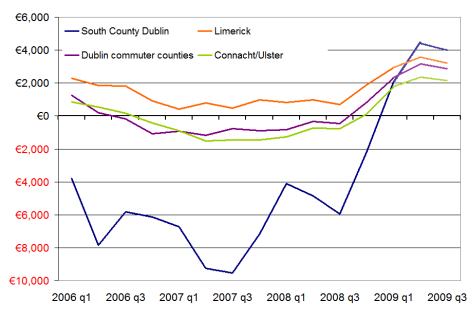
The graph below shows the difference between renting and buying in annual terms for four regions – south County Dublin, Limerick, Dublin’s commuter counties and Connacht/Ulster outside of Galway. It’s calculated for a first-time buyer couple, with mortgage interest relief based on the first year of repayments. I’ve taken ECB+1% as the benchmark interest rate – something which of course may only hold for the first year.


Annual savings for owning rather than renting, 2006-2009

Annual savings for owning rather than renting, 2006-2009

Even with property prices the way they were, it was cheaper to buy your house in 2006 than it was to rent it in everywhere around the country except South County Dublin. Generally, first-time buyers in Dublin could expect to save at least €2,000 over the course of their first year, while elsewhere they could expect to save about €1,000. Only in South County Dublin were first-time buyers actually paying any premium on ownership – in the order of €4,000 over the year for their three-bedroom home.

Sometimes I look back at 2005 and 2006 and wonder what we were all up to. Given those maths, it’s a bit easier to understand again. Of course, things didn’t stay that way. ECB rates started increasing and by mid-2007, potential first-time buyers were faced with the prospect of a premium on ownership in order of €1,000 over the first year – this at a time of uncertainty over capital values. In South County Dublin, the premium on home ownership for the first year was almost €10,000. It should be noted that in a couple of areas, South Dublin city (i.e. all areas with even postcodes), West Dublin and Limerick, it was cheaper to buy than rent – even when interest rates were at their highest. These areas have repeatedly exhibited the highest yields on residential property (about 4% over the past couple of years – high is relative).

Since late 2008, though, as lower interest rates have kicked in, there has been a dramatic swing in the maths back in favour of home-ownership. In late 2008, if you paid the asking price and got ECB+1% for your mortgage, you could expect to save €1,000 in most parts of the country – and more than €3,000 in Limerick or West Dublin. What’s worth noting is that this is at a time of rapidly falling rents as well as house prices. Looking at Q1 figures, that trend is growing with first-time buyers able to save in the region of €3,000 in their first year of ownership. Even in South County Dublin, a household will save money if they buy rather than rent.

How will these figures look in a year’s time? I’ve put in figures marked 2009 Q2 and Q3 to give an indication of how the buy-or-rent decision might look. I’ve assumed another 20% fall in house prices – that’s about a 40% fall from peak to trough. (If that sounds drastic, probably best not to read David McWilliams’ latest comparison of Ireland and Japan.) For rents, I’ve gone for 33% peak-to-trough fall (again, there are those who argue it could be more). In that scenario, buyers would continue be better off than renters in every part of the country. First-time buyers of three-bedroom properties would expect to save anywhere between €1,800 (West Leinster) and €7,000 (Dublin city centre).

To some extent, this is being driven by mortgage interest relief, which is greatest in Year 1. However, Q1 figures indicate that even if there were no mortgage interest relief, there are areas of the country where it is cheaper to buy than rent. And if house prices fall 40% from peak to trough, and rents fall 33%, it will be cheaper to buy than rent, even with no mortgage interest relief, in all areas of the country apart from South County Dublin.

What about the downside? If there are indeed significant swathes of vacant properties around the country that will continue to put pressure on rents for the next 3-5 years, could both rents and house prices halve from their peak values? If that were the case – meaning the typical three-bedroom home in south Dublin city would cost about €900 a month to rent or cost about €275,000 – the maths in favour of buying still look convincing in Dublin but elsewhere it’s a much tougher call. Without mortgage interest relief, homeowners would have to pay around €1,000 a year over what they’d pay to rent.

The tax system as it currently stands certainly strongly favours home ownership. If the government decides that the balance of emphasis when correcting its fiscal black hole should be on raising taxes rather than cutting expenditure, it may abolish mortgage interest relief and bring in a universal residential property tax. This could significantly alter the maths of buying versus renting and bring about the ‘nation of renters’. As it stands, though, even if rents were to halve over the coming year, the premium people pay to actually own their home appears too small for that to happen.

Where in Ireland has seen the biggest increase in unemployment?

My recent attempt to put some figures on the scale of negative equity in Ireland – which concluded that about 40% of Irish homes are worth less than when they were bought and that as many as 20% of homes may be in negative equity – sparked some discussion here, on thepropertypin and most thoroughly on irisheconomy.ie.

The original post was designed just to put some numbers on the potential problem of negative equity, leaving aside for the time being the implications. Two important strands of discussion have arisen about the implications. The first relates to financial consequences, as mentioned by Karl Whelan, particularly in relation to the proposed NAMA and the fate of the banks. The second broad strand of discussion, being led by Liam Delaney, relates to how negative equity has labour market implications, particular when unemployment is on the rise. (Unemployment and negative equity are mirror images of the home ownership/labour mobility discussion being led in the US by Richard Florida.)

I’m currently working on estimates of how many households are affected by the dual problem of unemployment and negative equity. Combined with the likelihood of falling rents over the coming two/three years, rents being the alternative income a homeowner could get from their house, this is a cocktail for widespread misery currently partially staved off by all-time low interest rates and therefore mortgage repayments.

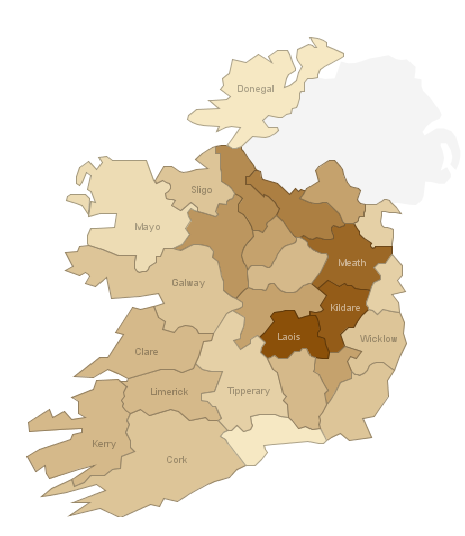
A next step in working out where both negative equity and unemployment will strike is looking in more detail at the problem of unemployment. The CSO provides very detailed statistics on unemployment by county/town and more occasional detail on the age profile and duration of unemployment. The map below gives an idea of ‘unexpected’ unemployment (original visualization here). It show the increase in those signing on by county in April 2009, compared to the average of 2005 and 2006, meant to indicate a natural level of unemployment (whether long-term or just switching jobs).

Unemployment in Ireland by county, April 2009 compared to 2005/2006

Unemployment in Ireland by county, April 2009 compared to 2005/2006

Those looking with relief at counties in a light brown – such as Waterford, Louth, Donegal and Mayo – should be aware that in all counties, the April 2009 was at least twice the 2005/2006 average. What’s more worrying, though, is that there are a number of counties where unemployment is three times what it was three years ago. In Meath and Kildare -stalwarts of Dublin’s commuter belt – unemployment has more than trebled. Likewise in Cavan and Laois.

The next part of the puzzle is to revisit county-level estimates of negative equity based on comments on the last set of figures and then try to put some numbers on how many households finds themselves faced with both unemployment and with a house worth less than their debt to the bank.

How many Irish homes are in negative equity?

Just over 500,000 thousand homes have been built since the start of 2002. Probably the same number again of second-hand homes have been bought in the same period. With the guts of one million properties having changed hands since 2002, how many of those are worth less than now than when they were bought? And how many owners find themselves owing more to the banks than they if they had to sell now?

Taking the daft.ie asking prices by county from 2006 on, and Dept of Environment regional figures before that, it’s possible to construct regional average prices going back in the 1980s. Fortunately, we don’t have to go back that far – but we do have to go back into the first half of this decade. By my calculations, of the half a million homes built since 2002, about 50% are now worth less than when they were bought. That’s based on current asking prices. If asking prices are – as some contend – about 10% above actual closing prices at the moment, the number of homes worth less now than when they were bought rises to 340,000 homes – or two thirds of the houses built since the start of 2002.

But that’s only half the story. Or slightly less actually, as loans for new homes account for just under 50% of all loans. If that ratio is correct, another 286,000 second hand homes now have asking prices less than the prices they were bought for. Again, if asking prices are 10% above what’s actually trading out there, that figure rises to about 382,500. In total, that represents about 725,000 homes that have been bought since 2004 that are now worth less. Depending on whether you take Census or Dept of the Environment figures, that represents between 37% and 43% of homes in the country. Put in plain English, two in five homes in Ireland are worth less now than when they were bought.

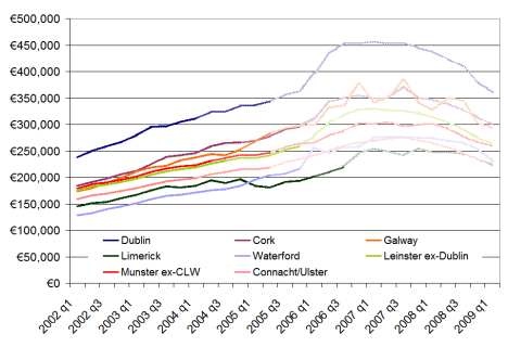
How far back has Ireland’s property market rewound? The graph below shows average home values in eight regions for the period 2002-2009. There are three shades of colour used – the lightest (further to the right) are house price gains that been wiped out, the medium shade represents current asking price levels, while the full colour lines represent asking prices less 10%. Overall, the asking price for the typical home in Ireland now is similar to what the home was worth in March 2005. If you believe asking prices are overstating true prices, the typical home in Ireland is now worth the same as it was in July 2004. The two years of bust have undone the last two and a half years of boom. Homes in Connacht and Ulster are worst affected – they are worth the same now as they were five years ago in early 2004.

When were Irish homes last worth what they're worth now?

When were Irish homes last worth what they're worth now?

Negative equity is, however, something more particular. It refers to the outstanding debt that someone owes the bank. In other words, if they sold the house now, would they be able to pay off the remaining debt from the sale price? Naturally, this is a much more complicated exercise. Dept of Environment figures suggest that the typical loan-to-value of new homes since 2002 has been about 75%, while for second-hand homes it’s been closer to 73%. Fortunately, the figures give something of a breakdown. Making some ballpark assumptions for different years, for example any 95%+ mortgage in 2004 or any 70%+ mortgage in 2007/2008, it’s possible to give a rough estimate of the number of homes in negative equity.

Roughly speaking, about half of the homes that are now worth less than when they were bought are in negative equity, in the financial sense of the word. (This makes intuitive sense, as two out of every five mortgages is less than 70%, suggesting a substantial amount of households with some equity still knocking around.) That’s 340,000 homes where if the homeowners have to sell, they will not be able to pay the bank back solely through the money they get from selling the house.

The punchline is that about one in five homes in Ireland is now in negative equity.

Are more open countries being hit harder in the recession?

This morning, the ESRI has published its latest Quarterly Economic Commentary, which led to George Lee being pushed on Morning Ireland into saying Ireland was the “worst in the developed world” when it came to economic contraction. Fortunately, within the last week, the IMF has produced its latest World Economic Outlook, “Crisis & Recovery“. This contains the latest predictions by the Washington-based organisation on economic output for all countries for this year out to 2014… although to be fair, the focus from most people is understandably on 2009, rather than 2014.

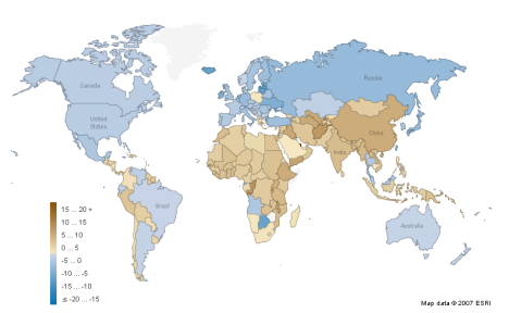
The map below – fully available on Manyeyes – shows estimated GDP growth (or not) by country in 2009, the worst year for the world economy since World War II. Speaking of war, while 27 countries are predicted to have strong growth in 2009, many of them are post-conflict countries, presumably with a lot of spare capacity and/or natural resources, such as Afghanistan, Congo, Ethiopia, Iraq, Laos, Myanmar and Timor Leste. A couple more are simple cases of natural resource-driven economies, such as Qatar and potentially Turkmenistan and Uzbekistan.

GDP growth, 2009 (Source: IMF)

GDP growth, 2009 (Source: IMF)

Large swathes of the world, almost 70 countries in total, are blue, meaning GDP contraction in 2009. These are concentrated particularly in developed and transition markets, as well as the larger economies of Latin America. A dozen economies face GDP contractions of greater than 5% this year. While Ireland is on the list, it is not a sore thumb, particularly when one looks at countries such as Iceland, Estonia and Singapore, also small open economies. In fact, the whole list of those worst affected this year reads, unfortunately, like a Who’s Who of Washington Consensus poster boys from earlier in the decade:

  • Botswana – one of Africa’s few success stories over the past two decades, growing at more than 8% a year until recently
  • Estonia, Latvia and Lithuania – three small open economies that had bought heavily into the dream of European integration
  • Iceland – no explanation needed, unfortunately
  • Ireland – end of the exporting good days… or end of the domestic boom?
  • Japan – one of two large economies on the list, facing collapsing export values
  • Russia – the other giant on the list, hit more heavily than other resource economies
  • Seychelles – a relatively successful and open economy, coming down from a heady 2006/2007 boom
  • Singapore and Taiwan –  two of Asia’s most successful exporters in the good days
  • Ukraine – again, a very strong economic performance since 2000, with natural resources playing their part

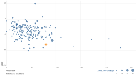
Largely speaking, these, the worst hit economies of the 2009 recession, are open economies and in many cases small ones too. I thought it would be worth investigating across the entire pool of almost 200 economies whether there was a correlation between 2009 performance and (1) openness and (2) 2001-2007 ‘trend’ growth. The full visualization is here (you can play with the axes, highlight your own country – Ireland highlighted below, flip the chart, etc..), but for the overall story, see below.

Openness & Growth, 2001-2009

Openness & Growth, 2001-2009

A quick guide to how to read it:

  • The further down a country is, the greater its GDP contraction this year. (Qatar’s expected phenomenal 20% growth this year – oh, to have gas reserves! – actually stretches out the axes a little more than ideal.)
  • The further to the right a country is, the more open it is, as measured by World Bank trade-GDP ratios. (The three trade-a-holics, Singapore, Hong Kong and Luxembourg, again stretch this out a little – closely followed, incidentally, by the Seychelles.)
  • And if two dimensions weren’t enough, the size of the bubble represents average growth between 2001 and 2007.

While not a perfect correlation, it’s pretty clear that more open economies are facing into tougher economic times. Two quick and related concluding remarks. Firstly, a second glance back at the map shows that Africa and Asia are the best performing continental economies this year. I doubt it’s a coincidence that the vast bulk of population growth over the coming two decades will be from these two regions. The slow but steady formalization of markets continues under the radar in both.

The second point builds on this. The story we were all sold in 2007 was one of decoupling. “No matter if the US and Europe go into recession,” went the story, “because the BRICs will rescue us.” Brazil and Russia in particular did not pass that test, but China and India have fared better. Both economies do look like coming in about 5 percentage points below 2001-2007 trend growth this year, which may certainly feel recession-esque, particular with global euphoria and expansion a thing of the past. Nonetheless, they are still among the fastest growing economies in the world, forecast at above 5% in 2009. China and India are also by the largest of the BRIC countries, with almost 30% of the world’s population, suggesting that they have a critical mass of domestic demand that Brazil and Russia lack.

Are Irish workers undertaxed?

Recently, an ad for Liveline included an angry woman, decrying Ireland as a ‘high tax’ economy. Her argument was: “What’s the point in working if the government is just going to take all our money anyway?” That baffled me. As far as I knew, Ireland was certainly not a high-tax economy, certainly compared to some of the Scandinavian economies. I decided this was worth a closer look. Just how much of a low-tax economy is Ireland? And – given the €25bn gaping hole in the budget is going to have to be solved through a mixture of both expenditure cuts and tax increases – are Irish workers undertaxed?

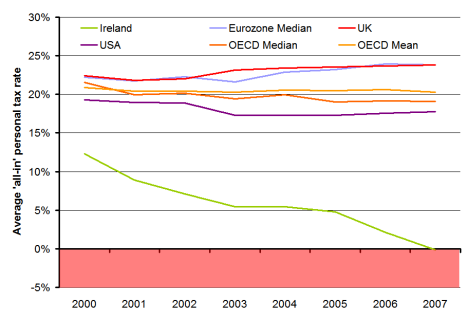
The graph below shows the average “all-in” personal income tax rate levied on people who earn the average industrial wage, for a range of economies including Ireland, from 2000 on. The figure given is an average tax rate for four stylised households (a single worker with no children, a single worker with two children, a married couple with one earner and no children and a one-earner couple with two children). The figure for each economy includes family cash transfers, paid in respect of dependent children between five and twelve years of age. All figures come from the OECD.

Average 'all-in' personal tax rates, selected economies, 2000-2007

Average 'all-in' personal tax rates, selected economies, 2000-2007

Amazingly, in 2007, Ireland would have negatively taxed the four households, supplementing their income by 0.2% on average. Needless to say, negative tax is not the norm, certainly not for the average worker. Ireland is out of line with every other developed OECD economy. Our closest competitors, in terms of not taxing the average worker, are the Czech Republic and Korea – but both of those have an average tax rate for the four cases above of just over 10%.

Excluding child benefit, Ireland is still the lowest taxer, but the gap between us and the rest of the developed world narrows substantially. But including child benefit or excluding it, Ireland taxes its average worker the least of the 28 developed economies in the OECD in six of the seven different measures of average ‘all-in’ tax that the OECD produces. Only for single workers without children did one country, Korea, tax less than Ireland in 2007.

It could be argued that the use of manufacturing wages for Ireland – compared to a broader definition of ‘industrial average’ in most other OECD economies – could be affecting the result as it lowers Ireland’s average wage. That may be the case, and would affect the level of Ireland’s line in the graph above – but it wouldn’t substantially alter the trend. Ireland was already one of the lowest taxers in the OECD in 2000 and yet it cut its taxes by twice as much as any other economy.

This pattern since 2000 is important for where we are now, because a common explanation of how Ireland got into its fiscal mess is over-reliance on receipts from property taxes. That’s certainly true, but this wasn’t a passive over-reliance. This wasn’t a case of leaving the rest of the economy as-is and just not realising the once-off nature of the property tax windfall. This was very much an active over-reliance on property. The economy and the tax system was actively re-ordered based on a presumption that receipts from a property transaction tax and related sources would be the centre of the new economy. This was done with what seems like a reckless determination to tax workers less and less, without a due consideration of the sustainability of that policy.

I’m not saying that we should have high taxes for the sake of it. For one thing, direct taxation is only one part of the story – Ireland’s indirect tax rate (i.e. VAT) is one of the higher rates in the OECD (although it’s certainly not out of line). In fact, I’m not necessarily arguing that income tax rates need to go up. I can find only country in the OECD – the Netherlands – where the top rate of tax is above 50%. The Czech Republic, for example, which manages to get 10% in tax on the measure above, only taxes 32% at the top rate.

What I’m arguing is that we need to look again at our thresholds, i.e. at what point on the income scale do we start taxing people. We’ve got ourselves into this mess since 2000 and we certainly need to get ourselves back out.

Tackling the thorny issue of teachers pay

Earlier this year, I calculated average salary estimates for the public and private sectors in Ireland. The answer, that the average worker in the private sector earned €40,000 last year, almost €10,000 less than their public sector counterpart, has proved if not controversial than certainly a starting point for debate. Given some of the comments on that blog post, and the fact that the teachers conferences were being held last week, I decided to look in a little more depth at the education sector. How much do teachers in Ireland earn? How does this compare with other people in Ireland? How do teachers’ salaries in Ireland compare with other eurozone teachers?

Trade unions have been clear on one point since the size of Ireland’s fiscal crisis became clear: those most in a position to pay should bear the brunt. At the same time, teachers unions have said that their pay is not up for discussion. This implies that teachers presume that they are not among those most in a position to pay. How does that stack up with the stats? The chart below shows average earnings in mid-2007, the latest data across all sectors, with public sectors marked in dark blue, private sectors in light blue, and semi-state in mixed blue.

Salaries by sector in Ireland, 2007 (source: cso.ie)

Salaries by sector in Ireland, 2007 (source: cso.ie)

The single most striking thing is that all the best paid sectors in Ireland are either public or semi-state industries. (Those looking for more detail might start with Dept of Education figures out last week showing that primary school teachers earn on average €57,000.) Surely, any objective trade union leader should be arguing that whatever burden workers have to bear, the bulk of it should be borne primarily by the public and semi-state sectors.

There are a few common queries people have with the relevance of these statistics. The first often runs: “Hang on, you’re not comparing like with like. All teachers have a degree, while who knows how many people do in, say, paper and printing.” Ideally, I’d like to have the stats to hand to explore this. Unfortunately I don’t. My only comment before we move on is that if finance and business services had come out as the best paid sectors in Ireland, would the same people have argued that we should wait and see whether their higher wages were justified by qualifications/experience/profit created? Or would people have argued that as they were best paid, they should pay most?

Let’s move on, though. If comparing education with other sectors in Ireland is not fair, let’s compare Irish teachers with their eurozone counterparts? After all, our old trick in situations like this was just to devalue and hope for the best. Now we share a currency with a dozen or so other countries. Are our teachers overpriced?

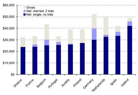
The graph below uses OECD statistics to examine teachers’ salaries across the eurozone. (I’ll take this chance to recommend the OECD’s Education at a Glance 2008: even if you hate absolutely everything I’m saying here, do take the opportunity to wander around its facts and figures.) In Ireland, a teacher in the job 15 years, single with no kids, earns more after tax than his or her counterparts do BEFORE they’ve been taxed in most other eurozone members. Marry that teacher off and give them two kids and – despite Germany’s best efforts to catch up – Irish teachers are by far the best paid of the ten eurozone countries shown.

Average salaries (gross and net) for teachers in the eurozone, 2007

Average salaries (gross and net) for teachers in the eurozone, 2007

OK, so Irish teachers are well paid relative to other Irish workers – they may just be better qualified. And yes, they’re paid substantially more than their eurozone counterparts. Perhaps price levels are so substantially higher in the rip-off republic that teachers in Ireland need this extra pay just to break even? Unfortunately, eurostat figures on comparative price levels don’t back that assertion up. Whereas prices in Ireland are indeed 15% higher than in France, the single teacher above enjoys 75% more take-home pay. In Finland, prices are just 2% below Irish prices, but an Irish teacher enjoys a wage that is 54% higher than a Finnish counterpart.

If prices don’t explain the international gap, maybe Irish teachers work a longer year than their eurozone counterparts, explaining why they get paid more. Unfortunately again for Irish teachers, the opposite seems to be the case, as the graph below shows. Teachers – particularly secondary school teachers – work less days on average than almost all their eurozone counterparts. This leaves the amount paid for every day spent teaching in Ireland looking pretty unsustainable. Factoring in the pension levy only scratches at the surface of the problem.

Days taught by teachers and earnings per day of teaching

Days taught by teachers and earnings per day of teaching

Ireland is currently grappling with a huge fiscal and economic crisis. The government faces lots of tough choices about what stays and what must go. The fact that they’ve chosen to cut back some education services suggests that they are missing what should be obvious: the more we bring Irish teachers’ salaries back in line with counterparts elsewhere in the eurozone, as well as with other sectors in Ireland, the less we’ll have to cut back on the range of education services we offer.

As teachers of maths should appreciate, the arithmetic is simple. The government needs to make savings across the board in publicly-funded services, including education. To make savings in education, we can either cut back on education services (quantity) or cut back on teachers salaries (price). Teachers have so far been successful in passing those two issues off as one, and thus creating a somewhat bizarre alliance of service providers (teachers) and consumers (parents/children).

Given how Irish teachers’ pay compares domestically and internationally, it’s time we separated out teachers’ pay from education cutbacks and took a long cold look at what our teachers are paid.

A brand new scare graph – Japan’s collapsing exports

I have just discovered a set of global trade statistics updated monthly by the Dutch Bureau for Economic Policy Analysis (CPB). (Incidentally, this is not the first time I’ve come across excellent work by the CPB – their work on administrative burdens imposed by regulation is essentially the international pioneer on the topic and has informed EU thinking on how to cut red tape.)

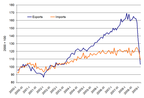
Rather than hundreds of words of rapier-sharp analysis, I thought I would just post one graph that I thought was the single most shocking thing I’ve seen this recession yet: Japan’s trade figures.

Japan's exports and imports, Jan 2000-Jan 2009

Japan's exports and imports, Jan 2000-Jan 2009

While Japan may have been ‘over-exporting’ – or at least ‘under-importing’ if domestic demand is moribund – the 40% year-on-year collapse in exports cannot be written off as just another statistic. Presumably driven by exports of cars, this has to make for dismal reading. China is not far behind, it seems, with exports down almost 20% year-on-year in late 2008.

As far as I know, even open countries such as Estonia (down 10%), Singapore (down 20%) and Ireland (down just 1%) have seen falls in exports but nothing like 40%. (Interestingly, imports have collapsed in Ireland, down almost 30%, while exports are static – are multinationals just clearing their output?)

For those who think this whole post is just far too optimistic, to REALLY depress yourself, have a look at this global – rather than US – comparison of the 1930s and today, A Tale of Two Depressions, by Kevin O’Rourke and Barry Eichengreen. As they note in their conclusion:

The world is currently undergoing an economic shock every bit as big as the Great Depression shock of 1929-30. Looking just at the US leads one to overlook how alarming the current situation is even in comparison with 1929-30. The good news, of course, is that the policy response is very different. The question now is whether that policy response will work.

Intergenerational outsourcing and the consequences of building 10% too much: A look at Ireland’s property market in 2013

With Davy Stockbrokers predicting a 70% fall in Irish construction activity from its peak over the coming ‘medium term’ (2009-2011 or so), I though it might be timely to review some headline statistics for Ireland’s property overhang.

Recently, I’ve been peddling the idea that between 2004 and 2007, we were building twice as many homes as we needed and building twice as many for 3/4 years implies building half as many as you need for 6/8 years to return to equilibrium. Does that stack up? Or, put another way, if we start in 2002 with Census statistics on the stock of housing, use Dept of Environment statistics for the period 2002-2008 and turn Davy’s figures into ballpark estimates for 2009-2013, how bleak will things look in five years time?

The answer, much to the chagrin of those who loathe two-armed economists, seems to be that it depends – in this instance on what part of the country you’re talking about, but also about what you think is the appropriate long-term need for new houses in this country. If we take 2001 figures (technically March 2002 figures) as our ‘departure from normality’ point, how far off course are we? Between 2002 and 2008, we churned out over half a million properties, off an existing base of just 1.3 million households. Back-of-the-envelope estimates, based on an overview of economists’ figures on this topic, suggests that we should have been building perhaps 300,000 households in that same period. (That’s using an equilibrium figure of 40,000 properties a year, rising temporarily after the accession of new EU member states.) So, enough with all the stats, what’s all this for, you wonder. Well, I was hoping to use all this to answer two key questions:

  • Where suffered worst from Ireland’s properties building bonanza? Where is housing inventory lying around most?
  • How long will we have to sit around building hardly anything until we’re back to some semblance of normality in the property market?

Where did we build our extra properties? By the end of 2008, we were about 5 years ahead of schedule – i.e. we’d built 12 years supply in just 7 years. To give a regional flavour, based on insights gleaned from the property overhang per county figures I calculated in December, I split Ireland into three regions – Dublin, Connacht/Ulster and the rest of the country. (The data allow for a full county-by-county analysis, however time constraints and poor formatting in the various external sources has prevented me from threatening another heatmap!) Over the period in question (2002-2008), more houses were built in Connacht/Ulster than there were in Dublin, which has almost twice the population! As a result, in terms of years of “pre-production”, if you will, while Dublin had under 2 years excess supply by end-2008, Connacht/Ulster had almost 8 years. Once more emphasis: builders managed to produce 15 years output in Connacht/Ulster in just 7 years.

How long will we have to sit around building nothing? It’s all very well for someone to come along after the fact and say “You shouldn’t have done that”. What’s more interesting is to shed some light on where the adjustment will come first and where it will be hardest. One option would be just to close up our construction sector for a few years until inventory shifts sufficiently and prices start to rise. Practically, of course output doesn’t and shouldn’t collapse to zero and, as per Davy’s figures, will be in the range of 10,000 to 25,000 over the coming 5 years.

Therefore, I’ve assumed output of 20k in 2009 (still slowing down), 10k in 2010 (bottom of the market) and then a simplistic 5k increase in output every year after that, rising to 25k in 2013. Let’s call this the ‘post-Section 23′ scenario. This is contrasted with a ’20:20 foresight’ scenario where steady-state output in construction remains 40,000, apart from a minor blip of 35,000 in 2009 due to global economic circumstances. In both scenarios, new houses are allocated according to a region based on its Census weight – crucially, and we can relax this later, even in our post-Section 23 world, output resumes in Connacht/Ulster, not at the distorted rates we saw but in proportion to its size. The result of all this is the chart below. The figures show the excess of properties as a percentage of the total property stock in each of the three regions.
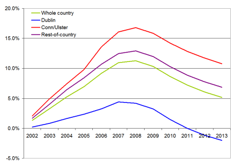
Ireland's excess properties, % of total properties, by region, 2003-2013f

Ireland's excess properties, % of total properties, by region, 2003-2013f

The results are pretty clear:

  • Even with some major internal restructuring of the construction industry (i.e. rebalancing output of houses according to a region’s weight in the economy), Connacht and Ulster will still have a significant property overhang, more than 10% by 2013 – and that itself based on a drastic 70% contraction in building activity from peak levels.
  • For most of the country – and indeed the country on average – the overhang will have halved by 2013 but will still be in the region of 5/6%.
  • In Dublin, shortages in housing may emerge as quickly as 2012.

Objections to the above might include one along the following lines: construction will not only contract 70% but also no-one will be building in Connacht/Ulster for years to come so even the rebalancing of output described above is not an accurate forecast. In that case, the overhang will just take the full 8 years from 2008. Section 23 and the property boom will have taken construction jobs from 2009-2015 and left them in 2002-2008 – a sort of integenerational outsourcing.

Another objection is that the optimistic (if 2012 is optimistic) scenario painted for Dublin hinges on that long-term need of 40,000 units a year (which translates into about 12,000 new units in Dublin annually, based on its Census weight). Significant and persistent net outward migration from Dublin from 2009 on – which incidentally is why I believe that Dublin Bus, so clearly an ‘inferior good’ in the economist’s sense of the word, is losing money when incomes fall – might mean that the demand for housing in the period 2009-2013 may fall to 20,000. Replacing 40,000 with 20,000, from 2009 on suggests that the average percentage overhang for the country stays stuck at 10% and Dublin – while still much lower – remains stuck at 3-4%.

In sum, we are where we are. We’ve more than enough houses everywhere in the country and plenty of houses in places where we won’t need them for another 10 years or so. Therefore, it would be wise for the Government to take this crisi-tunity, as Homer Simpson would say, to harness both supply and demand sides of the market.

  • On supply, it should focus the efforts of the much-trimmed residential construction industry, when that sector starts to medium-term plan in 2010/2011, on Dublin and other areas around the country most likely to show a shortage of property this side of 2015.
  • On demand, the Government should attempt to deliver balanced regional development, taking property overhang as an opportunity for affordable housing to create new centres of employment. Taking this to its most logical conclusion, firms outsource because they want to free up resources to specialize on what they’re good at. Therefore, we must adopt a mentality along the following lines: “Let’s take this opportunity to treat our property boom as intergenerational outsourcing, which has freed us up to focus on what we’re good at.” (Just don’t say all we’re good at is construction!)