Five years, six property markets, mixed fortunes

Last week, there was a brief discussion on thepropertypin of an interesting piece of economic history – in the 60 years following their construction in the late 1780s and early 1790s, the Georgian houses of Mountjoy Square fell in value by almost 94%. By comparison, nominal wages fell about 40%-50% during the same period, while the price of food – if bread is anything to go by – stayed largely the same (8 pence for a loaf of bread in the 1790s and in 1848). While I can’t claim to speak for anyone else reading, I would imagine the general perception was: “So property prices can adjust downward by percentages scarily close to 100% – but it probably takes a unique set of circumstances (Act of Union and all that).”

Yesterday, however, I read on Carpe Diem about the latest property price statistics from Detroit. Houses in Detroit are selling for an average of $11,500 at the moment, down an astonishing 88% from their peak values. That translates into a monthly mortgage payment of $50! And this happened not in 60 years of steady economic decline but in less than five years.

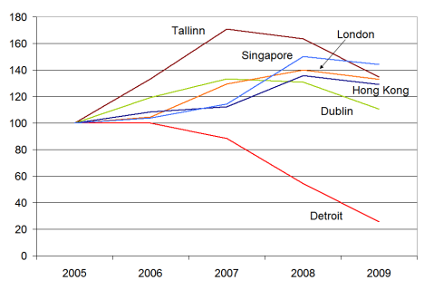
It got me thinking about Ireland’s property market in a global context, so I decided to do a little comparison of 2005-2009 for a smattering of cities. The cities were chosen in no particular way other than to give some global coverage, hence two Asian and one American cities, as well as two Western European and an Eastern European city. The figures refer to the start of the year concerned, with Jan 2005 set at 100 for all cities.

Property prices in six cities around the world, Jan 2005-Jan 2009

Property prices in six cities around the world, Jan 2005-Jan 2009

It was a slight surprise to see that, of the cities shown, none apart from Detroit had yet fallen below their Jan 2005 levels by the start of 2009. Indeed, some cities almost 50% above their 2005 levels. Dublin was closest – and more than likely has already fallen back to mid-2004 levels since the start of the year. Tallinn seems to be like an excess version of Dublin – rising and now falling faster. For Singapore and Hong Kong, 2007 seems to have been easily the craziest year, but the correction in 2008 was nowhere near as large. Meanwhile, Detroit props them all up.

For a view on how much more of a correction is needed for five economies, including the US, Ireland and Spain, you can have a look at property yields over the medium term here.

Are more open countries being hit harder in the recession?

This morning, the ESRI has published its latest Quarterly Economic Commentary, which led to George Lee being pushed on Morning Ireland into saying Ireland was the “worst in the developed world” when it came to economic contraction. Fortunately, within the last week, the IMF has produced its latest World Economic Outlook, “Crisis & Recovery“. This contains the latest predictions by the Washington-based organisation on economic output for all countries for this year out to 2014… although to be fair, the focus from most people is understandably on 2009, rather than 2014.

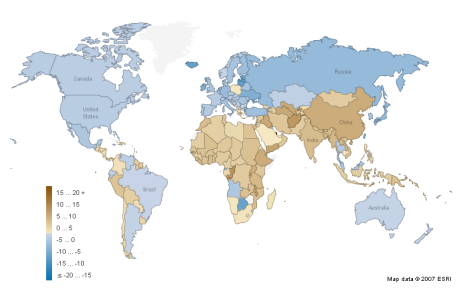
The map below – fully available on Manyeyes – shows estimated GDP growth (or not) by country in 2009, the worst year for the world economy since World War II. Speaking of war, while 27 countries are predicted to have strong growth in 2009, many of them are post-conflict countries, presumably with a lot of spare capacity and/or natural resources, such as Afghanistan, Congo, Ethiopia, Iraq, Laos, Myanmar and Timor Leste. A couple more are simple cases of natural resource-driven economies, such as Qatar and potentially Turkmenistan and Uzbekistan.

GDP growth, 2009 (Source: IMF)

GDP growth, 2009 (Source: IMF)

Large swathes of the world, almost 70 countries in total, are blue, meaning GDP contraction in 2009. These are concentrated particularly in developed and transition markets, as well as the larger economies of Latin America. A dozen economies face GDP contractions of greater than 5% this year. While Ireland is on the list, it is not a sore thumb, particularly when one looks at countries such as Iceland, Estonia and Singapore, also small open economies. In fact, the whole list of those worst affected this year reads, unfortunately, like a Who’s Who of Washington Consensus poster boys from earlier in the decade:

  • Botswana – one of Africa’s few success stories over the past two decades, growing at more than 8% a year until recently
  • Estonia, Latvia and Lithuania – three small open economies that had bought heavily into the dream of European integration
  • Iceland – no explanation needed, unfortunately
  • Ireland – end of the exporting good days… or end of the domestic boom?
  • Japan – one of two large economies on the list, facing collapsing export values
  • Russia – the other giant on the list, hit more heavily than other resource economies
  • Seychelles – a relatively successful and open economy, coming down from a heady 2006/2007 boom
  • Singapore and Taiwan –  two of Asia’s most successful exporters in the good days
  • Ukraine – again, a very strong economic performance since 2000, with natural resources playing their part

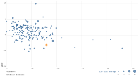
Largely speaking, these, the worst hit economies of the 2009 recession, are open economies and in many cases small ones too. I thought it would be worth investigating across the entire pool of almost 200 economies whether there was a correlation between 2009 performance and (1) openness and (2) 2001-2007 ‘trend’ growth. The full visualization is here (you can play with the axes, highlight your own country – Ireland highlighted below, flip the chart, etc..), but for the overall story, see below.

Openness & Growth, 2001-2009

Openness & Growth, 2001-2009

A quick guide to how to read it:

  • The further down a country is, the greater its GDP contraction this year. (Qatar’s expected phenomenal 20% growth this year – oh, to have gas reserves! – actually stretches out the axes a little more than ideal.)
  • The further to the right a country is, the more open it is, as measured by World Bank trade-GDP ratios. (The three trade-a-holics, Singapore, Hong Kong and Luxembourg, again stretch this out a little – closely followed, incidentally, by the Seychelles.)
  • And if two dimensions weren’t enough, the size of the bubble represents average growth between 2001 and 2007.

While not a perfect correlation, it’s pretty clear that more open economies are facing into tougher economic times. Two quick and related concluding remarks. Firstly, a second glance back at the map shows that Africa and Asia are the best performing continental economies this year. I doubt it’s a coincidence that the vast bulk of population growth over the coming two decades will be from these two regions. The slow but steady formalization of markets continues under the radar in both.

The second point builds on this. The story we were all sold in 2007 was one of decoupling. “No matter if the US and Europe go into recession,” went the story, “because the BRICs will rescue us.” Brazil and Russia in particular did not pass that test, but China and India have fared better. Both economies do look like coming in about 5 percentage points below 2001-2007 trend growth this year, which may certainly feel recession-esque, particular with global euphoria and expansion a thing of the past. Nonetheless, they are still among the fastest growing economies in the world, forecast at above 5% in 2009. China and India are also by the largest of the BRIC countries, with almost 30% of the world’s population, suggesting that they have a critical mass of domestic demand that Brazil and Russia lack.

Lopping the top half off & Ireland’s property market in a global perspective

On Monday the latest daft.ie report came out, showing that asking prices had fallen just over 4% in the first three months of the year. Yesterday, I changed focus on the blog a little, as it was Budget day, and tried instead  to put some numbers on what a potential property tax could raise.

Today, I hope to give a little more detail on the findings from the report itself, in particular regional trends, and then give an international perspective also – or at least start to give one, which I think is always instructive. Below is a graph showing the quarter-on-quarter change in asking prices for the last two quarters, i.e. Q4 2008 and Q1 2009, in each county.  The most obvious finding – probably not a surprise to anyone – is that asking prices fell in almost all counties in both quarters. A second clear finding is that there does not appear to have been one or two counties more affected in the last six months than elsewhere (although one could make the argument that Munster has got off relatively unscathed since September).

Quarter-on-quarter changes in house prices, 2008q4-2008q1

Quarter-on-quarter changes in house prices, 2008q4-2008q1

What also jumps out is that the two quarters saw very different patterns. In the final three months of 2008, a few counties – such as Galway, Westmeath and to a lesser extent Donegal and Leitrim – saw the largest downward adjustments in asking prices. Two counties, Mayo and Tipperary actually saw no fall in their asking prices. This quarter, Mayo and Tipperary actually had slightly larger falls than average – perhaps a sign that sellers there had been holding for the start of the year before acceding to the realities of the market. On the flip side, sellers in Galway and Westmeath believed in Q1 that their large adjustments in late 2008 did not need to be followed up with more adjustments straight away.

Sligo has been the worst hit county in terms of falling house prices, with a fall in the region of 10%in three months alone. (Dublin city centre and Waterford city actually saw bigger falls but they are lessened by other parts of their counties.) Aside from that, it seems that Dublin generally and the counties around it were among those with larger adjustments since the start of the year.

This leads on to perhaps a more interesting question – how have counties fared since their property prices peaked? To do that, I’ve set up another Manyeyes dataset (which anyone can access) with the percentage gap between house prices in a given quarter and the peak, for each county. Where a county is sandy coloured, that means it has peaked. The deeper the blue, the bigger the fall. (One little trick with these figures is that for a county’s earlier “blues”, prices are still going up. By the second row, that’s no longer an issue.)
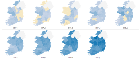
Change in asking prices from the peak, 2007-2009

Change in asking prices from the peak, 2007-2009

A couple of findings emerge, based interestingly on alternate axes of the country:

  • East peaked before west, on average, and by almost six months. If you draw a line from Cavan down to Wexford, 10 of the 13 counties peaked in the first half of 2008, more than half the country in population terms, including all of Dublin and its offshoots. Cork, Galway, Limerick and a few other counties actually peaked in the second half of 2007, while a couple of stragglers – Tipperary and Westmeath to be precise – only peaked in early 2008. (Interesting to note, in passing, their sellers’ totally different reactions to conditions in late 2008, as per the first chart above.)
  • North is falling faster than south, on average. If you draw a line from Dublin over to Galway, 9 of the 10 worst affected counties so far come from that half of the island. The top half of the property market – literally! – has been lopped off more than the bottom half. This means that the north-east – essentially Dublin-plus – fell first and is falling hardest, while the south-west – Munster – was last to fall and has fallen least so far. It will be interesting to compare these emerging trends, two years into the property crash, with the final statistics on Ireland’s property readjustment/crash/Armageddon/return to sanity/fill in name here.

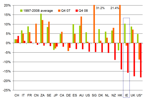
Speaking of writing the history books, perhaps it’s no harm to have a quick look to our left and our right and see how other property markets are faring. Below is a chart of about 20 countries (with two different measures in there for the US, the first is the OFHEO measure, while US* is the Case-Shiller national index). I’ve based this on data posted on the Economist’s website, but have surreptitiously replaced the 2007/2008 ESRI data, about which there is a lot of scepticism currently, with daft.ie data. The bars show the annual rate of change in house prices, including a 1997-2008 average, and figures for 2007 and 2008. (As per the Economist website, some of the Q4 08 figures are actually Q3 08 while a couple, including Ireland, are Q1 09.)
International comparison of property markets, 1997-2009

International comparison of property markets, 1997-2009

Replacing the ESRI data with the daft.ie had the effect of moving Ireland from the “Club of Moderates” such as Denmark and the Netherlands, to the “Bleeding Edge” group with Hong Kong, the UK and the US (at least one measure for the US at any rate). I will do my best to try and track down the original data for this series so that a change-from-peak measure can be contructed as again that may be more instructive than a year-on-year change, particularly in six months time.

In the meantime, though, I’ll leave this up here and ask for any insights, comments or queries, as per usual! Fire away…