Is it cheaper to buy or rent?

Introducing the daft report earlier this year, Gerard O’Neill discussed the possibility that we might become a nation of renters. On the other hand, there is a lot of talk at the moment, particularly from those selling homes such as these guys in Palmerstown, about how it is significantly cheaper to buy than to rent. I thought it would be worth investigating this a little more, because at the end of the day, despite all the crazy economic goings-on of the past three years, people still have to make a decision about where and how to live. Is it cheaper to buy than rent, and if so by how much? How do things look now compared to the boom years and how will things look if house prices and rents continue to fall?

To do this, I had a look at average prices and rents for three-bedroom properties around the country from the start of 2006 on. I wanted to calculate the annual premium for owning your accommodation as opposed to just renting it, bearing in mind mortgage interest relief, prevailing interest rates and changing property values and rents. After all, economic theory would suggest that if you get to own the asset at the end of thirty years of living there, you should pay more than if you don’t.

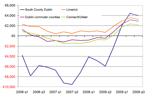
The graph below shows the difference between renting and buying in annual terms for four regions – south County Dublin, Limerick, Dublin’s commuter counties and Connacht/Ulster outside of Galway. It’s calculated for a first-time buyer couple, with mortgage interest relief based on the first year of repayments. I’ve taken ECB+1% as the benchmark interest rate – something which of course may only hold for the first year.


Annual savings for owning rather than renting, 2006-2009

Annual savings for owning rather than renting, 2006-2009

Even with property prices the way they were, it was cheaper to buy your house in 2006 than it was to rent it in everywhere around the country except South County Dublin. Generally, first-time buyers in Dublin could expect to save at least €2,000 over the course of their first year, while elsewhere they could expect to save about €1,000. Only in South County Dublin were first-time buyers actually paying any premium on ownership – in the order of €4,000 over the year for their three-bedroom home.

Sometimes I look back at 2005 and 2006 and wonder what we were all up to. Given those maths, it’s a bit easier to understand again. Of course, things didn’t stay that way. ECB rates started increasing and by mid-2007, potential first-time buyers were faced with the prospect of a premium on ownership in order of €1,000 over the first year – this at a time of uncertainty over capital values. In South County Dublin, the premium on home ownership for the first year was almost €10,000. It should be noted that in a couple of areas, South Dublin city (i.e. all areas with even postcodes), West Dublin and Limerick, it was cheaper to buy than rent – even when interest rates were at their highest. These areas have repeatedly exhibited the highest yields on residential property (about 4% over the past couple of years – high is relative).

Since late 2008, though, as lower interest rates have kicked in, there has been a dramatic swing in the maths back in favour of home-ownership. In late 2008, if you paid the asking price and got ECB+1% for your mortgage, you could expect to save €1,000 in most parts of the country – and more than €3,000 in Limerick or West Dublin. What’s worth noting is that this is at a time of rapidly falling rents as well as house prices. Looking at Q1 figures, that trend is growing with first-time buyers able to save in the region of €3,000 in their first year of ownership. Even in South County Dublin, a household will save money if they buy rather than rent.

How will these figures look in a year’s time? I’ve put in figures marked 2009 Q2 and Q3 to give an indication of how the buy-or-rent decision might look. I’ve assumed another 20% fall in house prices – that’s about a 40% fall from peak to trough. (If that sounds drastic, probably best not to read David McWilliams’ latest comparison of Ireland and Japan.) For rents, I’ve gone for 33% peak-to-trough fall (again, there are those who argue it could be more). In that scenario, buyers would continue be better off than renters in every part of the country. First-time buyers of three-bedroom properties would expect to save anywhere between €1,800 (West Leinster) and €7,000 (Dublin city centre).

To some extent, this is being driven by mortgage interest relief, which is greatest in Year 1. However, Q1 figures indicate that even if there were no mortgage interest relief, there are areas of the country where it is cheaper to buy than rent. And if house prices fall 40% from peak to trough, and rents fall 33%, it will be cheaper to buy than rent, even with no mortgage interest relief, in all areas of the country apart from South County Dublin.

What about the downside? If there are indeed significant swathes of vacant properties around the country that will continue to put pressure on rents for the next 3-5 years, could both rents and house prices halve from their peak values? If that were the case – meaning the typical three-bedroom home in south Dublin city would cost about €900 a month to rent or cost about €275,000 – the maths in favour of buying still look convincing in Dublin but elsewhere it’s a much tougher call. Without mortgage interest relief, homeowners would have to pay around €1,000 a year over what they’d pay to rent.

The tax system as it currently stands certainly strongly favours home ownership. If the government decides that the balance of emphasis when correcting its fiscal black hole should be on raising taxes rather than cutting expenditure, it may abolish mortgage interest relief and bring in a universal residential property tax. This could significantly alter the maths of buying versus renting and bring about the ‘nation of renters’. As it stands, though, even if rents were to halve over the coming year, the premium people pay to actually own their home appears too small for that to happen.

Where in Ireland has seen the biggest increase in unemployment?

My recent attempt to put some figures on the scale of negative equity in Ireland – which concluded that about 40% of Irish homes are worth less than when they were bought and that as many as 20% of homes may be in negative equity – sparked some discussion here, on thepropertypin and most thoroughly on irisheconomy.ie.

The original post was designed just to put some numbers on the potential problem of negative equity, leaving aside for the time being the implications. Two important strands of discussion have arisen about the implications. The first relates to financial consequences, as mentioned by Karl Whelan, particularly in relation to the proposed NAMA and the fate of the banks. The second broad strand of discussion, being led by Liam Delaney, relates to how negative equity has labour market implications, particular when unemployment is on the rise. (Unemployment and negative equity are mirror images of the home ownership/labour mobility discussion being led in the US by Richard Florida.)

I’m currently working on estimates of how many households are affected by the dual problem of unemployment and negative equity. Combined with the likelihood of falling rents over the coming two/three years, rents being the alternative income a homeowner could get from their house, this is a cocktail for widespread misery currently partially staved off by all-time low interest rates and therefore mortgage repayments.

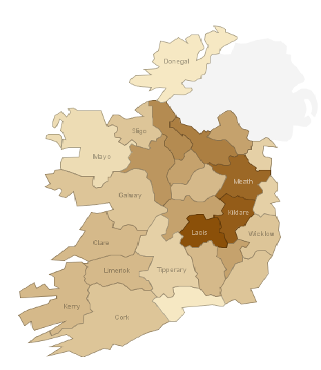
A next step in working out where both negative equity and unemployment will strike is looking in more detail at the problem of unemployment. The CSO provides very detailed statistics on unemployment by county/town and more occasional detail on the age profile and duration of unemployment. The map below gives an idea of ‘unexpected’ unemployment (original visualization here). It show the increase in those signing on by county in April 2009, compared to the average of 2005 and 2006, meant to indicate a natural level of unemployment (whether long-term or just switching jobs).

Unemployment in Ireland by county, April 2009 compared to 2005/2006

Unemployment in Ireland by county, April 2009 compared to 2005/2006

Those looking with relief at counties in a light brown – such as Waterford, Louth, Donegal and Mayo – should be aware that in all counties, the April 2009 was at least twice the 2005/2006 average. What’s more worrying, though, is that there are a number of counties where unemployment is three times what it was three years ago. In Meath and Kildare -stalwarts of Dublin’s commuter belt – unemployment has more than trebled. Likewise in Cavan and Laois.

The next part of the puzzle is to revisit county-level estimates of negative equity based on comments on the last set of figures and then try to put some numbers on how many households finds themselves faced with both unemployment and with a house worth less than their debt to the bank.

Are Irish workers undertaxed?

Recently, an ad for Liveline included an angry woman, decrying Ireland as a ‘high tax’ economy. Her argument was: “What’s the point in working if the government is just going to take all our money anyway?” That baffled me. As far as I knew, Ireland was certainly not a high-tax economy, certainly compared to some of the Scandinavian economies. I decided this was worth a closer look. Just how much of a low-tax economy is Ireland? And – given the €25bn gaping hole in the budget is going to have to be solved through a mixture of both expenditure cuts and tax increases – are Irish workers undertaxed?

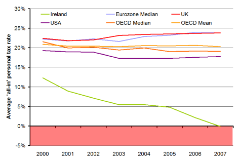
The graph below shows the average “all-in” personal income tax rate levied on people who earn the average industrial wage, for a range of economies including Ireland, from 2000 on. The figure given is an average tax rate for four stylised households (a single worker with no children, a single worker with two children, a married couple with one earner and no children and a one-earner couple with two children). The figure for each economy includes family cash transfers, paid in respect of dependent children between five and twelve years of age. All figures come from the OECD.

Average 'all-in' personal tax rates, selected economies, 2000-2007

Average 'all-in' personal tax rates, selected economies, 2000-2007

Amazingly, in 2007, Ireland would have negatively taxed the four households, supplementing their income by 0.2% on average. Needless to say, negative tax is not the norm, certainly not for the average worker. Ireland is out of line with every other developed OECD economy. Our closest competitors, in terms of not taxing the average worker, are the Czech Republic and Korea – but both of those have an average tax rate for the four cases above of just over 10%.

Excluding child benefit, Ireland is still the lowest taxer, but the gap between us and the rest of the developed world narrows substantially. But including child benefit or excluding it, Ireland taxes its average worker the least of the 28 developed economies in the OECD in six of the seven different measures of average ‘all-in’ tax that the OECD produces. Only for single workers without children did one country, Korea, tax less than Ireland in 2007.

It could be argued that the use of manufacturing wages for Ireland – compared to a broader definition of ‘industrial average’ in most other OECD economies – could be affecting the result as it lowers Ireland’s average wage. That may be the case, and would affect the level of Ireland’s line in the graph above – but it wouldn’t substantially alter the trend. Ireland was already one of the lowest taxers in the OECD in 2000 and yet it cut its taxes by twice as much as any other economy.

This pattern since 2000 is important for where we are now, because a common explanation of how Ireland got into its fiscal mess is over-reliance on receipts from property taxes. That’s certainly true, but this wasn’t a passive over-reliance. This wasn’t a case of leaving the rest of the economy as-is and just not realising the once-off nature of the property tax windfall. This was very much an active over-reliance on property. The economy and the tax system was actively re-ordered based on a presumption that receipts from a property transaction tax and related sources would be the centre of the new economy. This was done with what seems like a reckless determination to tax workers less and less, without a due consideration of the sustainability of that policy.

I’m not saying that we should have high taxes for the sake of it. For one thing, direct taxation is only one part of the story – Ireland’s indirect tax rate (i.e. VAT) is one of the higher rates in the OECD (although it’s certainly not out of line). In fact, I’m not necessarily arguing that income tax rates need to go up. I can find only country in the OECD – the Netherlands – where the top rate of tax is above 50%. The Czech Republic, for example, which manages to get 10% in tax on the measure above, only taxes 32% at the top rate.

What I’m arguing is that we need to look again at our thresholds, i.e. at what point on the income scale do we start taxing people. We’ve got ourselves into this mess since 2000 and we certainly need to get ourselves back out.

How many months supply is sitting on the property market?

The US leads the way for many types of statistics – and in particular for their timeliness. The housing market is no different, with a plethora of measures such as prices and volume of transactions out every month.

In Ireland, though, we have to labour under a dearth of timely statistics on a range of economic indicators – including the housing market. Naturally, the Daft Report tries to make its contribution, publishing one week after quarter’s end so that people have the latest asking price and stock/flow information. One that I’m increasingly asked for is the number of months of supply currently sitting on the property market, a measure that’s well established in the US. It’s probably time we tried to put some numbers on it.

To do that, we need to answer two questions. The first is: what is a normal volume of transactions for the Irish property market? The second is: how many are on the market now?

On the first, the natural way to go about it would be to use the recent level of transactions. The only problem with that, though, is that the number of transactions has fluctuated wildly over the past four years, making that a somewhat erratic measure. To counteract that, the Department of the Environment have a long-run series on loan approvals, which for all intents and purposes tells us how many people are buying property every year. The numbers still vary hugely over the past two decades, in line with the vicissitudes of Ireland’s property market. In 1990, there were just 35,000 transactions – less than 3,000 a month – while in 2005, there were over three times as many transactions, 120,000 in total.

Taking the 2005 figure – or indeed anything since about 2000 – leaves open the accusation that one is deliberately underestimating the problem by overestimating the “typical” month. Then again, anything pre-1999 – and certainly anything close to 1993 – is probably not too appropriate either. To overcome this, one can view the last 15 years of Ireland’s property market as two stylized periods: a (relatively) healthy property market in the 1990s, where monthly transactions averaged 4,400, and a hyperactive property market, 2000-2007, where monthly transactions averaged 7,800.

Using the 2000-2007 figure gives us a lower bound, while using the 1993-2000 gives an upper bound. Given that Ireland is the guts of 700,000 residents bigger now than in 1993 (even allowing for outward migration), it probably makes sense to use the average of the two figures (about 6,000 transactions a month) as some sort of post-2007 reasonable estimate of what one could expect would pass through the market in a healthy post-crunch Ireland.

To answer the second question, how many properties are currently on the market, I’ve taken the daft.ie series of stock of property for sale. An adjustment has been made, given the way new developments are listed on the site, to make sure that vacant new builds are better captured than the raw figures may suggest.

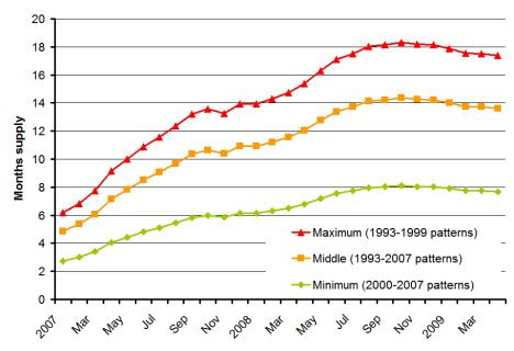
After all those preparations, where are we? The chart below shows the best estimate (orange) of the number of months property sitting on the market from early 2007 to April 2009 – alongside upper (red) and lower (green) bounds, based on whether one believes that the 2000-2007 level of transactions is ‘normal’ or in fact when everything dies down we’ll see a return to much lower 1993-1999 levels of transactions instead.

Estimated number of months supply on Ireland's property market

Estimated number of months supply on Ireland's property market

In a normal property market, one might expect to see three or four months supply sitting on the market – that’s about how long it takes for a property to go through the cycle of litsing, viewing, agreement, closure. The graph above – if you accept the middle ground presented – is that there has been a over a year’s supply of property sitting on the market since this time last year, compared to about 5 months at the start of 2007.

Good news? These days, good news is really just absence of new bad news! The good news is that while there is about three times as much property on the market as normal, this has levelled off – and indeed fallen slightly – in the last six months.