How many Irish homes are in negative equity?

Just over 500,000 thousand homes have been built since the start of 2002. Probably the same number again of second-hand homes have been bought in the same period. With the guts of one million properties having changed hands since 2002, how many of those are worth less than now than when they were bought? And how many owners find themselves owing more to the banks than they if they had to sell now?

Taking the daft.ie asking prices by county from 2006 on, and Dept of Environment regional figures before that, it’s possible to construct regional average prices going back in the 1980s. Fortunately, we don’t have to go back that far – but we do have to go back into the first half of this decade. By my calculations, of the half a million homes built since 2002, about 50% are now worth less than when they were bought. That’s based on current asking prices. If asking prices are – as some contend – about 10% above actual closing prices at the moment, the number of homes worth less now than when they were bought rises to 340,000 homes – or two thirds of the houses built since the start of 2002.

But that’s only half the story. Or slightly less actually, as loans for new homes account for just under 50% of all loans. If that ratio is correct, another 286,000 second hand homes now have asking prices less than the prices they were bought for. Again, if asking prices are 10% above what’s actually trading out there, that figure rises to about 382,500. In total, that represents about 725,000 homes that have been bought since 2004 that are now worth less. Depending on whether you take Census or Dept of the Environment figures, that represents between 37% and 43% of homes in the country. Put in plain English, two in five homes in Ireland are worth less now than when they were bought.

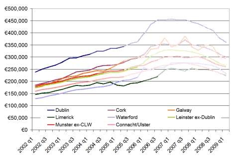
How far back has Ireland’s property market rewound? The graph below shows average home values in eight regions for the period 2002-2009. There are three shades of colour used – the lightest (further to the right) are house price gains that been wiped out, the medium shade represents current asking price levels, while the full colour lines represent asking prices less 10%. Overall, the asking price for the typical home in Ireland now is similar to what the home was worth in March 2005. If you believe asking prices are overstating true prices, the typical home in Ireland is now worth the same as it was in July 2004. The two years of bust have undone the last two and a half years of boom. Homes in Connacht and Ulster are worst affected – they are worth the same now as they were five years ago in early 2004.

When were Irish homes last worth what they're worth now?

When were Irish homes last worth what they're worth now?

Negative equity is, however, something more particular. It refers to the outstanding debt that someone owes the bank. In other words, if they sold the house now, would they be able to pay off the remaining debt from the sale price? Naturally, this is a much more complicated exercise. Dept of Environment figures suggest that the typical loan-to-value of new homes since 2002 has been about 75%, while for second-hand homes it’s been closer to 73%. Fortunately, the figures give something of a breakdown. Making some ballpark assumptions for different years, for example any 95%+ mortgage in 2004 or any 70%+ mortgage in 2007/2008, it’s possible to give a rough estimate of the number of homes in negative equity.

Roughly speaking, about half of the homes that are now worth less than when they were bought are in negative equity, in the financial sense of the word. (This makes intuitive sense, as two out of every five mortgages is less than 70%, suggesting a substantial amount of households with some equity still knocking around.) That’s 340,000 homes where if the homeowners have to sell, they will not be able to pay the bank back solely through the money they get from selling the house.

The punchline is that about one in five homes in Ireland is now in negative equity.

Lopping the top half off & Ireland’s property market in a global perspective

On Monday the latest daft.ie report came out, showing that asking prices had fallen just over 4% in the first three months of the year. Yesterday, I changed focus on the blog a little, as it was Budget day, and tried instead  to put some numbers on what a potential property tax could raise.

Today, I hope to give a little more detail on the findings from the report itself, in particular regional trends, and then give an international perspective also – or at least start to give one, which I think is always instructive. Below is a graph showing the quarter-on-quarter change in asking prices for the last two quarters, i.e. Q4 2008 and Q1 2009, in each county.  The most obvious finding – probably not a surprise to anyone – is that asking prices fell in almost all counties in both quarters. A second clear finding is that there does not appear to have been one or two counties more affected in the last six months than elsewhere (although one could make the argument that Munster has got off relatively unscathed since September).

Quarter-on-quarter changes in house prices, 2008q4-2008q1

Quarter-on-quarter changes in house prices, 2008q4-2008q1

What also jumps out is that the two quarters saw very different patterns. In the final three months of 2008, a few counties – such as Galway, Westmeath and to a lesser extent Donegal and Leitrim – saw the largest downward adjustments in asking prices. Two counties, Mayo and Tipperary actually saw no fall in their asking prices. This quarter, Mayo and Tipperary actually had slightly larger falls than average – perhaps a sign that sellers there had been holding for the start of the year before acceding to the realities of the market. On the flip side, sellers in Galway and Westmeath believed in Q1 that their large adjustments in late 2008 did not need to be followed up with more adjustments straight away.

Sligo has been the worst hit county in terms of falling house prices, with a fall in the region of 10%in three months alone. (Dublin city centre and Waterford city actually saw bigger falls but they are lessened by other parts of their counties.) Aside from that, it seems that Dublin generally and the counties around it were among those with larger adjustments since the start of the year.

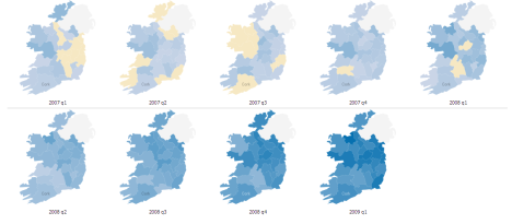
This leads on to perhaps a more interesting question – how have counties fared since their property prices peaked? To do that, I’ve set up another Manyeyes dataset (which anyone can access) with the percentage gap between house prices in a given quarter and the peak, for each county. Where a county is sandy coloured, that means it has peaked. The deeper the blue, the bigger the fall. (One little trick with these figures is that for a county’s earlier “blues”, prices are still going up. By the second row, that’s no longer an issue.)

Change in asking prices from the peak, 2007-2009

Change in asking prices from the peak, 2007-2009

A couple of findings emerge, based interestingly on alternate axes of the country:

  • East peaked before west, on average, and by almost six months. If you draw a line from Cavan down to Wexford, 10 of the 13 counties peaked in the first half of 2008, more than half the country in population terms, including all of Dublin and its offshoots. Cork, Galway, Limerick and a few other counties actually peaked in the second half of 2007, while a couple of stragglers – Tipperary and Westmeath to be precise – only peaked in early 2008. (Interesting to note, in passing, their sellers’ totally different reactions to conditions in late 2008, as per the first chart above.)
  • North is falling faster than south, on average. If you draw a line from Dublin over to Galway, 9 of the 10 worst affected counties so far come from that half of the island. The top half of the property market – literally! – has been lopped off more than the bottom half. This means that the north-east – essentially Dublin-plus – fell first and is falling hardest, while the south-west – Munster – was last to fall and has fallen least so far. It will be interesting to compare these emerging trends, two years into the property crash, with the final statistics on Ireland’s property readjustment/crash/Armageddon/return to sanity/fill in name here.

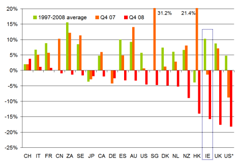
Speaking of writing the history books, perhaps it’s no harm to have a quick look to our left and our right and see how other property markets are faring. Below is a chart of about 20 countries (with two different measures in there for the US, the first is the OFHEO measure, while US* is the Case-Shiller national index). I’ve based this on data posted on the Economist’s website, but have surreptitiously replaced the 2007/2008 ESRI data, about which there is a lot of scepticism currently, with daft.ie data. The bars show the annual rate of change in house prices, including a 1997-2008 average, and figures for 2007 and 2008. (As per the Economist website, some of the Q4 08 figures are actually Q3 08 while a couple, including Ireland, are Q1 09.)

International comparison of property markets, 1997-2009

International comparison of property markets, 1997-2009

Replacing the ESRI data with the daft.ie had the effect of moving Ireland from the “Club of Moderates” such as Denmark and the Netherlands, to the “Bleeding Edge” group with Hong Kong, the UK and the US (at least one measure for the US at any rate). I will do my best to try and track down the original data for this series so that a change-from-peak measure can be contructed as again that may be more instructive than a year-on-year change, particularly in six months time.

In the meantime, though, I’ll leave this up here and ask for any insights, comments or queries, as per usual! Fire away…

Irish house prices fall 4% since the start of 2009 – latest daft.ie report

Ireland’s property slump marked it second birthday today, with the news from the latest daft.ie report that asking prices for residential property fell 4.2% in the first three months of 2009. This latest drop in prices marks the eight consecutive quarter that prices have fallen.

As the official press release notes, the national average asking price now stands at just over €280,000, meaning that prices have fallen almost €70,000 from the peak in early 2007. What’s interesting to note at this stage is that Dublin was worse hit on average over the first quarter – in particular Dublin city centre, where prices fell by 11%. Other notable falls since the start of the year are Sligo and Waterford city, where prices fell by about 10% in three months.

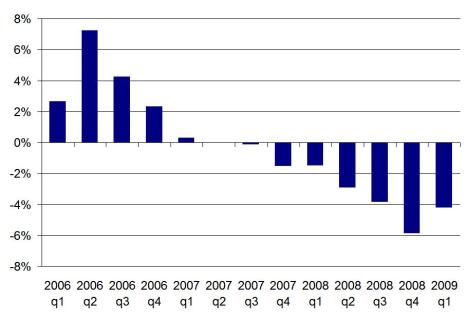
The fall in the first three months of the year should not be underestimated, particularly as the year-on-year rate of change has now slid to -15.7%. Nonetheless, a graph of the quarterly change in asking prices gives some food for thought. The falls in house prices got worse and worse more or less every quarter from mid-2007 on – until now, as the diagram below shows. How much we can read into this, though, will have to wait until next quarter, when we can see if the trend continues.

Change in national average asking price from quarter before, source: daft.ie

Change in national average asking price from quarter before, source: daft.ie

Commentator for this report is Liam Delaney, a behavioural economics expert. He discusses the importance of psychology – and the value in terms of self-worth of things like owning a house or having a job – in current economic conditions. He draws an important distinction between public and private sector workers (or at least that’s how I interpret it):

This report – combined with the recent labour force figures – indicates considerable hardship for those in once solid middle-class jobs that are now facing a potential double-whammy. People will inevitably feel even worse when they see neighbours and friends who are in better situations. Consider the position of a college graduate who purchased in Dublin in 2006, based on the income from his financial services job (now gone), to the position of his neighbour who secured a public sector position on leaving college and purchased in 2001. While neither is laughing, the latter must at least be considering himself the better off of the two. They are certainly not in the same boat and the widening rift in society being generated by asset price decline and employment uncertainty is the defining theme of our time. As described by John Fitzgerald and others, there are many who are currently better off than last year, as they are facing declining prices and interest rates in the context of stable employment in their sector.

He also describes two scenarios for the future, drawing on Gerard O’Neill‘s own commentary on a previous Daft report, where he suggested that the current economic maelstrom in which Ireland finds itself is probably the only thing that could possibly ever turn Ireland into a nation of renters – the implication being that may just happen. Liam then walks through the implications of these two scenarios:

One version of a national narrative that was articulated in the previous commentary by Gerard O’Neill was the idea that the Irish cultural and psychological need for property may be displaced by a culture where renting is given more credence as part of a normal adult life. Were such a story about the Irish relation to property to take hold, it would clearly have substantial implications for any potential future rebound in property prices. Key players at the moment are those who can afford property but are riding out the current uncertainty by taking advantage of falling rents. If they follow Gerard’s story, they may never come back into the buying market and the next generation may follow them into long term renting.

Yet, we still hear strongly the story that the Irish have always been and will always be wedded to the idea of home ownership as a fundamental part of maturing into adulthood. If such a story about Irishness and adulthood maintains its hold, house prices will eventually settle at a higher level, and changes in the market will depend on macroeconomic conditions, rather than on the type of seismic shift in Irish culture described by Gerard.

I’ll be posting each day this week on different findings from the latest figures, starting tomorrow with a Budget-day special… did someone say an Irish property tax? Later in the week, I’ll also look at the stock of property for sale – which incidentally has now fallen, however slightly, each of the last six months – but before I do, a quick comment on asking prices versus closing prices. Accurate measurement of house prices is a hot topic at the moment – it seems the ptsb closing price index reached a minimum fall in year-on-year terms of 10%, while asking prices haven’t yet found their nadir.

Changes in asking and closing prices, 2007-2009

Changes in asking and closing prices, 2007-2009

The full report is available at www.daft.ie/report and contains, as mentioned above, a commentary by Liam Delaney, Lecturer in Economics with the Geary Institute, UCD, as well a regional and county-by-county analysis of the latest trends in the property market.

Brrr… Sure ’tis cold in Sligo: A heat-map of Ireland’s property prices since early 2007

As those who’ve checked out/had to put up with my many word clouds on various different topics from Wicklow genealogy to Barack Obama will testify, I’m always looking for new ways to present data and information. For those with similar interests, a useful tool in that regard is Manyeyes, a free data visualization service offered by IBM. First thing you might do when you click through is have a wander around some of its featured visualizations, such as the OECD economic outlook or the World Cup Finals.

You needn’t stop there, though, as once you’ve registered, you can upload datasets yourself and visualize them. What’s particularly cool, in my opinion, is the ability to do maps with subnational data points, e.g. for the USA, China and, somewhat surprisingly until you remember IBM’s presence in the country, Ireland.

So I plugged in some county-level statistics from the Daft.ie database, in particular the year-on-year % change in asking prices by county from the first quarter of 2007 to the third quarter of 2008. The results are available for all to see on Manyeyes – I haven’t been able to put a live visualization up here, but you can get a sneak preview below and indeed the whole shebang just by clicking on the picture.
E9a845ba-c221-11dd-9c2e-000255111976 Blog_this_captionWhat, even clicking on the link is too much hassle? OK, here’s the lazyman’s version:

Heat-map of Ireland's property prices

Heat-map of asking prices for Irish property, 2007/2008

The easiest way to get the overview of the story – but with the minimum detail and surprise factor – is to go straight from 2007-q1 to 2008-q3. As you can see the map goes from totally brown to totally blue! But that naturally is hiding a lot of detail… So here are some other highlights on regional trends in Ireland’s property market:

  • Sligo is a constant underperformer – having enjoyed some of the smallest increases in the first half of 2007, it’s now suffering from some of the largest falls in 2008
  • Aside from Sligo, West Leinster was the first region in the country to suffer from falling house prices, in year on year terms, with Longford and Laois falling in year-on-year terms by (and we can pretty much throw in Westmeath there too, where prices were no higher than a year previously, in the same quarter)
  • In late 2007, asking prices in south-east Leinster (e.g. Carlow, Kilkenny) and neighbouring Munster counties (Tipperary, Waterford) were still rising in year-on-year terms.
  • Limerick was the last bastion of rising house prices. It’s the only county not to have registered two consecutive quarters of year-on-year falls in house prices… yet!
  • Have a look at 2007-q4… poor old Donegal just doesn’t get it! Even in early 2008, it was still at it. In Q3 2008, though, with prices down over 11% compared to a year earlier, it’s landing with a bang.

There are just some initial observations on the figures – overall, Manyeyes is a pretty useful tool, I’d have to say. I’d be interested in hearing anyone else’s observations on regional differences in price trends. What have I missed? Or indeed, what should I be heat-mapping?